Designing a Better Interface for Microservices Development
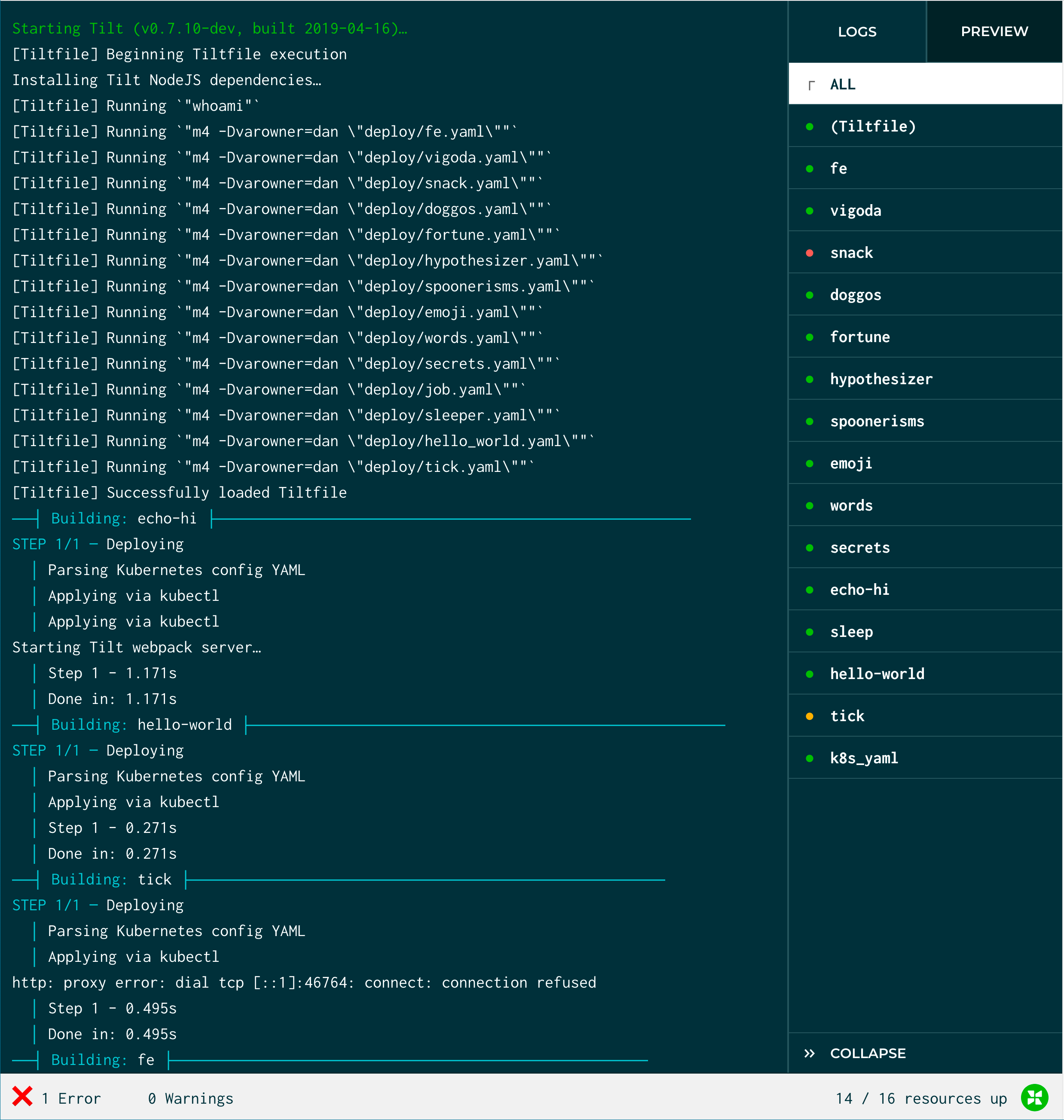
In Tilt, you can now browse logs for all your microservices in a web interface. See an overview of how your resources are running, look through streaming logs, and preview HTTP endpoints. You can also scroll and search through a single stream that multiplexes all logs. Theses logs persist as Tilt hums along re-building and re-deploying your code.
 If you’ve already played with Tilt, you still see our familiar Terminal UI when you
 tilt up in your project. Hit enter on any resource to see the web UI.
…Is that all?
If you’re familiar with popular log aggregation dashboards, you might find this to be rather a humble way to explore logs. Where are the complex search queries, the visualizations, and other investigative tools?
Well, what I love about designing Tilt is that we’re forging ahead in a space with scant precedent. We want to be your companion in the “inner loop” of development, when you’re iterating on code pre-commit, and certainly before you push to prod. So while those log aggregation interface conventions can be excellent inspiration, we don’t copy tools that were never made for the inner loop.
Tilt focuses on an area most others neglect, so instead of replicating a familiar convention, my work here is a distinct challenge: we make a skeleton, see it walk, then flesh it out.
So, how do we know which way to walk? Below, you’ll see the travelogue of where we’ve been. It’s more of an exploration than a straight path, so I’m thankful to be guided by strong convictions about what our tools should feel like:
Tilt should show a lightweight, responsive, and trustworthy overview as you iterate in (or on) your microservices architecture. We’re engineers, so we know things go wrong as a matter of course. Because the clues you need are fragmented across various streams with varying levels of obscurity, understanding why is the hidden problem. Troubleshooting common issues should not require deep expertise; Tilt should be a focused tool that helps you suss out root causes when you’re still in flow, not only a forensic lenses to examine outages days hence.
Where have we been?
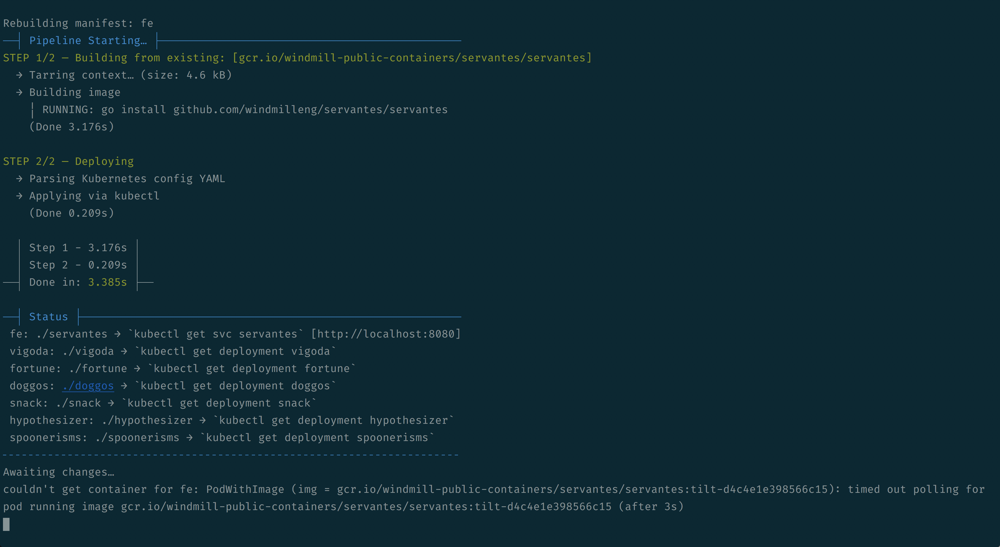
Early iterations of tilt up used to stream multiplexed logs inline in your command line. And while you could pipe this output to grep or other fave command-line tools for further analysis, having this as your sole interface to Tilt really only communicated a few things. “Hey, we’re working.” and “Okay, now we’re waiting for your next move.”
 You can still see this output with
 tilt up --hud=false
The logical next evolution was to give people an overview. What’s Tilt doing in response to your file changes? What’s happening with your cluster?
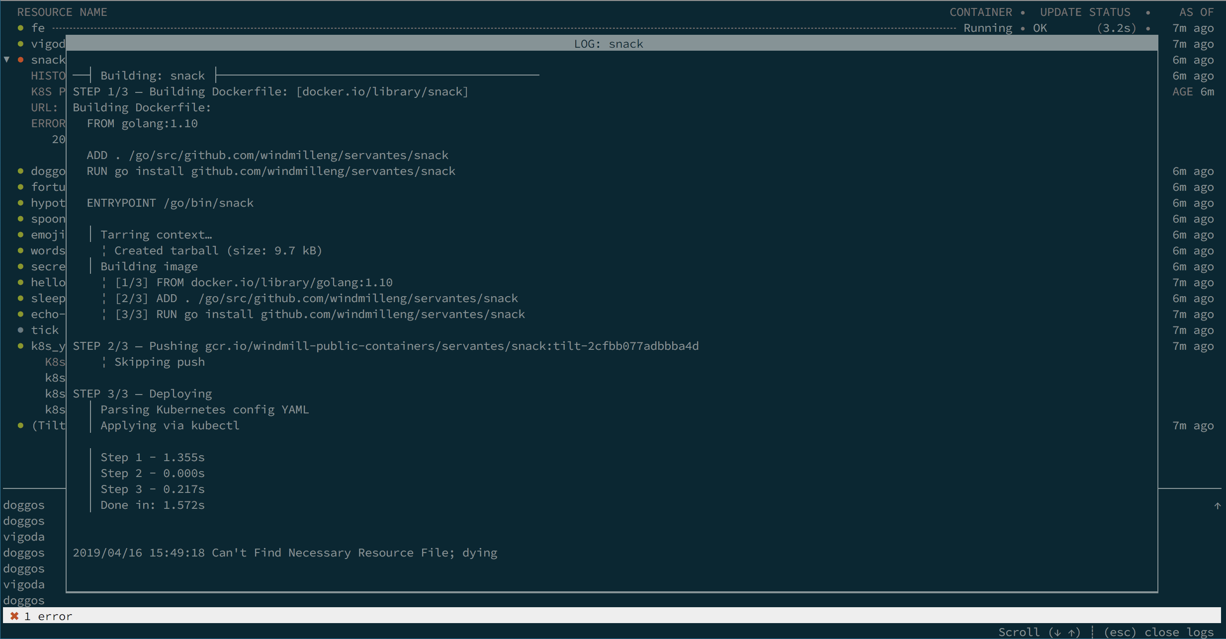
Our subsequent Terminal UI (TUI) shows your resources, insight into their status, and some ways to browse logs: With a resource selected, you hit “enter” and see a scrollable modal window with logs.
 Tilt’s Terminal UI log modal
Limitations of TUI
But building a Terminal UI app has special challenges, both in design and implementation. Scrolling through streaming logs can feel cumbersome; Unicode box-drawing characters hitchhike along when you try to copy log output; the way we retained logs in memory made Tilt a real CPU hog. And if we want features like robust search, it’d be a real investment we’d have to build from scratch.
Any of these issues could be fixed, sure, but some only with asymptotic effort. This gut sense of struggling uphill against the limitations of particular platform is often a sign it’s time to step back and rethink.
So — what are the special talents of a Terminal interface? Seeing a TUI launch with tilt up was pleasing in many ways: fast, lightweight, and evocative of a developer aesthetic that feels nostalgic to some, and just like home for others.
And what are the drawbacks? Since TUI interaction should be driven by the keyboard, having lots of interface nooks to explore requires either a steep learning curve of key chords and sequences (hi, Emacs and Vim), or creating new interface elements that don’t have a ton of precedent in the world of TUI. (For those familiar with web design history, this brings to mind the Cambrian explosion of scrollbar variants in Flash apps, no two alike.)
Where are we now
In writing the spec for our new web interface, I started with this premise:
Tilt’s Terminal UI should be only for awareness. We reliably show the current high-level state of the system, so you see if everything is OK or if there’s something to investigate.
For investigating, we take you to our web app. There, you can browse and search full logs for every resource. We leverage the built-in search functionality of the browser. And it’s a skeleton to build on.
I expect to continue negotiating between awareness and investigating by iterating on our design affordances (all possible actions that an interface suggests and provides). Tilt gets better when we understand how our premises meet the reality of your actual workflows. So, your take is essential!
Please check out our latest release and let us know what you think.
Originally posted on the Windmill Engineering blog on Medium


