
Accessibility Matters
Commit of the Month: Improve Accessibility of Status Icons
Details matter. Especially when those details impact usability. That’s why we paid close attention when we got reports that Tilt’s terminal UI was not colorblind friendly. Take a look at this screenshot:
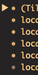
Can you tell at a glance which of these resources are up, and which ones have errored? It’s hard. If you were red-green colorblind, it would be even harder. It might look something like this:
While we expect most people to be using the Web UI (which is more fully featured though it exhibited a similar problem that was fixed in a different commit) if your workflow lives in the terminal we want to support that too. So in 842b83131f78431dd1ba8522e6288226a09c4cfc we improved the terminal UI’s accessibility by adding status icons that are structurally distinct from one another in addition to having distinct hues. Now Tilt’s status icons look like this:
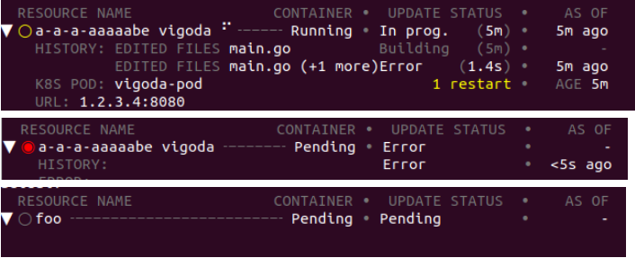
Even in grayscale, it’s now easy to tell that these icons represent different states.
Thanks to Han Yu and Nick Santos for their work on this!
Over two billion people in the world have visual impairments, and we want them to have a great experience too.
The only way to get there is with deliberate effort, and we’d like to thank the Tilt community members who brought this to our attention. If you spot any other accessibility concerns in Tilt, please open a GitHub issue!
Related
I heard you like extensions

Using Pack and Buildpacks